
1. Open up Photoshop and Create a new layer.
2. Use the Text Tool
 to write something in black using the “Creampuff” font.
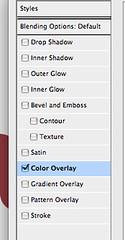
3. Choose “Color Overlay” from the Layer Style options.
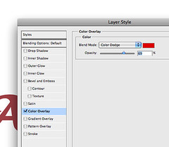
4. Select a pinkish color. Because it makes most people think of candy or something edible(….like babies). For your reference, I’m using these settings….. Color Overlay >> #9e5859. Let’s name this layer ‘Base’.
5. Duplicate this current layer twice by dragging it to the layer button two times.

6. Name one of the duplicates ‘Hard’ and the other ‘Sugar’. This is just for the sake of the tutorial, really you could name them whatever you want. Make sure you order the three layers so that ‘Base’ is underneath ‘Hard’ and ‘Sugar’ is topmost.
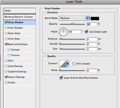
7. Hide the layer named ‘Sugar’ for now. Select ‘Hard’ so we can make it look like hard candy (now you see why I named it that?). Use the following settings in your layer style.
Drop Shadow Settings
Opacity = 50%, Angle = 90%, Distance = 2px, Spread = 3px, Noise = 0%, Layer Knocks Out Drop Shadow = Yes
Bevel and Emboss Settings
Style = Inner Bevel, Technique = Smooth, Depth = 471%, Direction = Up, Size = 8px, Soften = 0px, Use Global Light = Yes, Gloss Contour = Gaussian, Anti-Aliased = No, Highlight Mode = Screen at 42% with a White (#ffffff) Color Setting, Shadow Mode = Multiply at 17% with a Black (#000000) Color Setting.
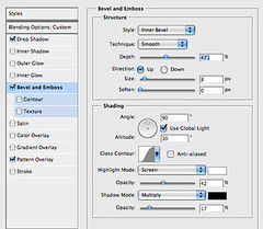
These settings serve to make your candy text look three dimensional.
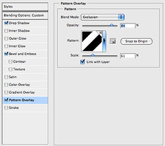
8. Next we want to select a Pattern Overlay. This step isn’t necessary but a little decoration will make your candy look more appetizing. Before you attempt this, make sure you’ve loaded ‘candy_stripes.pat’ into your version of Photoshop.
Make the following setting changes.
Pattern Overlay Settings
Blend Mode = Exclusion, Pattern = Pattern 1 (my choice, you can choose differently), Scale = 61%, Link With Layer = Yes
We’re all done making the candy look hard. Now it’s time to lick it….no seriously.
9. In this step we’re going to make our candy look like someone has salivated all over it…either that or maybe someone dipped it in a sugary sweet candy coating! (note: This is the hardest part of tutorial to explain but you’ll figure it out.”)
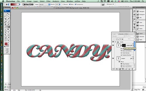
Activate the layer named ‘Sugar’. Hold down the ‘command’ (’control’ on a PC) and click on the layer to select all the letters in your word. Add a layer mask to it.

Hit ‘L’ to select the Lasso Tool and select the ‘Intersect with Selection’ option. Make sure you CLICK ON THE LAYER MASK FIRST before you go to Step 10.
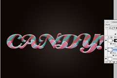
10. Now that you’ve selected the layer mask and not your actual text, draw around your selection loosely and fluidly. The idea is to make this look like liquid. It doesn’t matter if you go out side of the lines or get too crazy, you can fix it later by editing the mask. Once you’ve made a selection through the whole word, go back to your starting point and let go of the mouse. This will subtract everything from the selection except for what you’ve just drawn! (note: click the image below for a close-up view!)
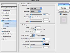
11. Now Make the following settings to the Layer Style of the topmost layer ‘Sugar’.
Bevel and Emboss Settings (note: this makes it look like a candy coating)
Style = Inner Bevel, Technique = Smooth, Depth = 100%, Direction = Up, Size = 5px, Soften = 0″
Color Overlay Settings (note: this gives the liquid a bit sugary glow and a bit of pop)
Blend Mode = Overlay, Opacity = 23%
Gradient Overlay Settings
Blendmode = Screen, Opacity = 35%, Style = Linear, Align with Layer = Yes, Angle = 90%, Scale = 100%
Gradient Color = #6f1d1d as the darker hue with #FFFFFF as the lighter hue.
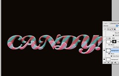
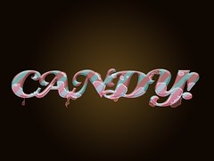
12. Lo and behold you’re done! You’ve got hard candy dipped in sugary sweetness!
13. We COULD stop there but I always like to ’sweaten’ (no pun intended) my designs with color backgrounds. Create blank layer. Add a Color Overlay in the Layer Styles and set the color to #0f0702.
14. Add a new layer. Add a Layer Mask. Select the Gradient Tool (Hit the ‘G’ Key) with the normal black/white colors. Set it to Radial and Reversed. Drag from the center of your image to the outside of the screen. Bam. Instant spotlight. Now add the Color Overlay of your choice.
Simple right? Don’t you just want to lick the screen? Of course we could get far more detailed with this but this tutorial is long enough! Make sure you download the files below to make sure you’ve done things correctly! Email me your derivative works or your improvements and I’ll profile them on this blog. jongos [at] gmail [dot] com
Download this Tutorial with all relevant PSD, Font and Pattern Files here! Download just the font here!


